Hitched to Everything Else at MoCA Arlington
Transcript of Hitched to Everything Else artist talk:
The Moment
Margaret AtwoodThe moment when, after many years
of hard work and a long voyage
you stand in the centre of your room,
house, half-acre, square mile, island, country,
knowing at last how you got there,
and say, I own this,is the same moment when the trees unloose
their soft arms from around you,
the birds take back their language,
the cliffs fissure and collapse,
the air moves back from you like a wave
and you can't breathe.No, they whisper. You own nothing.
You were a visitor, time after time
climbing the hill, planting the flag, proclaiming.
We never belonged to you.
You never found us.
It was always the other way round.
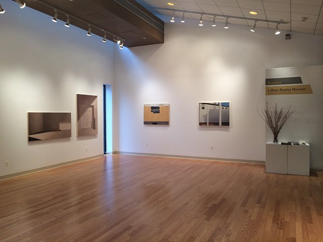
Let me start by saying that this work all comes from a super personal place. For me, place and physical sensation and how we move through the world have always been foundational to my experience of being alive. Since I was quite young, sensation has been grounding, reassuring, to me. Further, it’s been a source of joy. The sound of the wind in the trees, the sharp sting of cold air in my nostrils, the sun on my back, the itch of grass and crumbly satisfaction of dirt between my toes, the smell of hot rocks and wet leaves and moldering forest floor, even the vexation of being pursued by flies: these are all threads that weave us into place. They remind us we can be fitted into our place in “the family of things,” as Mary Oliver put it.The work you see here is in part a meditation on how we are and are not fitted to our place as a species. In our daily lives, we generally operate as if we only live in the human world, sometimes as if the human world is the world. Or we go out into “nature” and act like we haven’t been shaping it, for better and for worse, since the beginning. We impose a false dichotomy between these realms. We don’t pay attention to how they are overlaid, connected, fitted together like puzzle pieces – they are really just one world. We fail to acknowledge the reality that we have human concerns and must exist within a broader system at the same time. We act as if we are separate from, above, in control of “nature.” We exploit the land and the species that live here with us. To some extent, we do this because we have legitimate needs and may not be able to see a better path forward. But to a large extent, we do this because we just aren’t paying attention to the bigger picture, we don’t afford the non-human world the same consideration we have for our own species. While we don’t exist in separate spheres, we act like we do and much is damaged by this intellectual laziness or, more often, outright dishonesty.
Darwin is often misunderstood as having described the “survival of the fittest,” when what he actually wrote was “survival of the fit.” As in, fit to place, fit to community. Organisms don’t usually just move into a place. They co-create and are created by place. Yet we operate as if we are above finding ways to be fitted to the world, as if we can dictate instead. This myopia and inflexibility makes the whole system fragile. The “natural” world is destabilized, and the “human” one is too. So in these paintings, there’s a slippage I’m grappling with: a thing is sometimes stripped away because it is threatened or damaged, sometimes because we’re not giving proper regard and can’t see what is right in front of us, and sometimes because we don’t feel reconciled to the world. It’s this estrangement that I think I keep coming back to – how we are of nature but we proceed as if we are apart from it.
Let me pause for a moment to say that these paintings are not a broad, banal statement about how bad humans are. They’re expressions of my own personal grief and joy about how I am and am not “fitted” to the world. Grief because, on a purely practical level, I don’t know how to better inhabit the world. I do the things you’re supposed to do to help protect the environment. We all have that running list in our reads. But I live in this “human” world. I use this bridge (pointing to the painting entitled in the gap between) through my neighborhood woodlands which took three years to build, required that dozens of trees be cut down, caused waterways to be diverted, killed uncounted animals, and whose fences and disruptive construction bisected the park, thus shrinking habitat for the deer and foxes and beavers. I need that bridge to get to work. I am grateful for it. I go to that lake and use that viewing platform (pointing to the painting entitled this simple learning) so I can find a little peace. But my very presence is disruptive even when I’m careful to “leave no trace.” The smell of human sweat on hiking trails can cause animals to avoid a “wild” area. The foot traffic on these trails can destroy plants and mosses. I use a smartphone and store files and information in the cloud. The mining and server farms required to make this possible release toxins and carbon dioxide that are lethal. But I have apparently accepted this horror so I can participate in the “human” world. It makes me ill. It is hypocrisy and I hate it. But I don’t know another way to function in this world I live in.
The joy in the paintings is perhaps more obvious. They show many beautiful moments, each of which began as an encounter in the landscape – moments that occurred while I was out for a casual walk or on a hike in the “wilderness” (this I put in quotes because our influence is actually quite pervasive. Human meddling can be found in the remotest mountains, and what may seem to be “untouched” land almost never is). I was raised by hippies, as you have no doubt already guessed, and spent a good deal of my childhood outdoors and barefoot. A lot of that time was spent in the mountains, which felt like home. I became a rock climber and went to college in the mountains. When I moved to Baltimore 20 years ago, I cried every day because I was surrounded by concrete and couldn't walk in the dirt barefoot. So I’ve made a practice of finding the outlets I need wherever I can: intimacy with growing things and running water and sun-baked rocks. I do leave the city for hikes when I can, but “nature” can be found in myriad places – not just in national parks and wilderness preserves – but also in city parks, the scrubby land between the highway and a shopping center, a strip of woods at the edge of a neighborhood, the polite right-of-way between adjacent properties. I find the outlets I need and visit those places. It is a relief. But I still don’t know how to reconcile the fact that I am nourished by nature at the same time my very existence is destroying it.
And I really don’t know how to reconcile with the fact that not everyone has access to this sort of relief. You really do need a car to leave the city for a hike. Backpacking is impossible without gear, which is expensive. Add to this the fact that if everyone who desires this relief were to visit wilderness areas, we would utterly destroy these landscapes. Add to that the fact that our national parks were themselves formed in violence by forcibly removing native people from what we pretended were “untouched” lands. Over the centuries, countless landscape paintings celebrating the sublime vastness of nature have been produced (particularly out west) and were immediately used by our government for propaganda purposes.
So not everyone has access to the “wilderness.” And not everyone has access to the little scraps of nature in the city either. If you live in certain high-density areas, you simply cannot walk to a city park. Wealthy neighborhoods are more likely to be planted with trees along the road or be close to a park, while poorer neighborhoods are often 10 degrees hotter in summer due to unmitigated expanses of concrete.
My work has for several years explored relationships between the built environment and what is sometimes considered wild, or the power dynamics at play when land is claimed for some particular human purpose. Increasingly, I’ve become more interested in what we can learn from the historical record etched onto the surface of our home planet and how our relatively brief presence will reverberate into the future.
Landscape is an active, living participant in the events of our history as was as a literal record of time itself: accumulations of actions and events. Many of these are things we take for granted, like (some of us) being able to digest dairy products after infancy, or the location of railroad tracks, or the high likelihood that big cities will be situated near large bodies of water. These all follow from the realities of landscape, even when the causal relationship isn’t immediately obvious to the observer. But landscape is also a record of time, of history. When one considers how long we existed before the written word, we realize that our own human story is often only recorded in the land. Deep time is reflected in the land as well. Volcanoes and flood basalts have buried millions of miles of land under lava as deep as 2 ½ miles, supercontinents have repeatedly and violently assembled and broken apart, seas have moved, ancient corals have literally built mountains. Geology and biology are interdependent in “the meter of eternity” (to borrow a phrase from Ursula K Le Guin). Trees became possible only once early plants figured out how to break rocks apart into dirt and pull minerals into their bodies, allowing trunks to form. Hospitable living conditions are constantly created and destroyed as the earth’s thermostat forms limestone and then erodes it. Carbon dioxide levels in the air, oxygen levels in the oceans, and global temperatures fluctuate as the raw materials used by both geology and biology circulate. The landscape and living organisms must constantly respond to the changes brought on by the other.
We humans must live amongst the accumulated history of that which has gone before, on a human scale as well as a geological one. Our history and our land shape and create us. In turn, we shape the land and the future. In William Mackaskill’s fascinating book What We Owe the Future, he speaks of the changes we might impose upon the world, noting that “we will not know how long they will last, or how significant they will be.” We are currently creating a world that others will have to live in and we are flying blind. Unintended consequences abound, including on a geological level. Newly formed rocks are even now being created by sedimentary processes and contain degraded plastics. To quote David Farrier, “the irony of the Anthropocene is that we are conjuring ourselves as ghosts that will haunt the very deep future.”
These paintings are for anyone who wishes they could protect what they love, who feels anxiety and fear about the uncertain future of humanity, the planet, and life itself. I want to create accessible imagery that offers perspective about the ongoing process by which geology and life shape one another, and locate our moment within the broader context of “deep time.” In his excellent book The Ends of the World, Peter Brannen outlines the five major mass extinctions that have occurred in the past and the sixth which may well be underway. Somehow, life has recovered after each. We live, in Janine Benyus’s words, “on a competent planet. And we’re a part of it. And we’re young.” I want to believe we’ll find a way to be more “fitted” here before we destroy most of life on the planet, to operate from a place of care. But if we don’t, I have come to accept and even find solace in life’s ability to recover because life is a force that keeps finding a way.
Art has certainly changed the world at times. But for myself and my work, it feels like arrogance to entertain such a possibility, especially since I don’t feel I have any answers and there are great thinkers in positions much better suited to solving these problems on a large scale (I’m thinking of Kim Stanley Robinson’s excellent book Ministry for the Future – if you haven’t read it, please do!). I’m pretty confident my paintings will not influence politicians to enact policies that could mitigate the worst effects of climate change, protect the waterways, or preserve habitat. The dangers we face are already well understood by most, and will never be understood by those who choose ignorance. But from the time before we became fully human, we’ve been making art about what it is to be alive, what it is to experience. Part of that experience is loss mixed with joy, grief and joy mixed with hope. Art has always been one of the ways we cope with complex emotions and precarity. I find myself unable to do anything else with my work than to act as witness, to bare my own turmoil and hope that it reaches someone who is struggling with the same anxiety and despair. I hope this work will help viewers feel more connected to each other and our earth, regardless of how long we might have here.
The poet Padraig O’Tuoma has said that poetry is interested in stopping in a small moment and telling the story of that moment. It’s not interested in telling the whole story. The small moments can be helpful when you’re stuck in a story where you can’t see the outcome. I quite like this notion, and have intuitively taken a similar approach with my paintings. By extrapolation or implication, in the ways that connotations are overlaid with one another, the small moments I choose to pay attention to may help us navigate the larger story.
If you’ll permit me to read one last poem before wrapping up:
Want
Carrie FountainThe wasps outside
the kitchen window
are making that
thick, unraveling sound
again, floating in
and out of the bald head
of their nest,
seeming not to move
while moving,
and it has just occurred
to me, standing,
washing the coffeepot,
watching them hang
loosely in the air—thin
wings; thick, elongated
abdomens; sad, down—
pointing antennae—
that this
is the heart’s constant
project: this simple
learning; learning
how to hold
hopelessness
and hope together;
to see on the unharmed
surface of one
the great scar
of the other; to recognize
both and to make
something of both;
to desire everything
and nothing
at once and to desire it
all the time;
and to contain that desire
fleshly, in a body;
to wash it and rest it
and feed it; to learn
its name and from whence
it came; and to speak
to it—oh, most of all
to speak to it—
every day, every day,
saying to one part,
“Well, maybe this is all
you get,” while saying
to the other, “Go on,
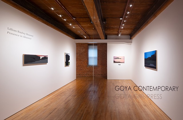
break it open, let it go.”Presence in Absence at Goya Contemporary, October 15 - December 10, 2021
Lillian Bayley Hoover ARTFORUM Spring 2020
The Pollock-Krasner Foundation has awarded $2.8 million to 121 artists and not-for-profit organizations. Among this year’s grant cycle recipients, which hail from seventeen states, seventeen countries, and Puerto Rico, are Alejandra Alarcon, Julie Beaufils, Tomasz Klimczyk, Cătălina Nistor, and Prudence Whittlesey.
In support of not-for-profit institutions that engage directly with Lee Krasner’s and Jackson Pollock’s work, grants will also go to the Solomon R. Guggenheim Museum in New York for its upcoming exhibition “Away from the Easel: Jackson Pollock’s Mural,” the Vermont Studio Center for its residency program, and Artadia in New York for its Immigrant Artists Fellowship.
The Lee Krasner Awards, which are based on the same criteria as the grants but are given in recognition of lifetime achievement, will honor Shimon Attie, Squeak Carnwath, Blane De St. Croix, Laddie John Dill, and Chris Drury. De St. Croix was also the 2020 recipient of the Brian Wall Foundation Grant for Sculptors, a $25,000 prize bestowed by the Brian Wall Foundation and administered by the Pollock-Krasner Foundation.
“From the beginning of Lee Krasner’s career to the planning of her legacy, she understood the importance of supporting professional artists,” said Ronald D. Spencer, the foundation’s chairman and CEO. “Thanks to her vision and generosity, the foundation is proud to advance and highlight the work of our 2019–20 grant and award recipients. As communities around the world continue to navigate these unique and difficult times, the foundation’s mission to foster the work and development of artists helps ensure they can continue to create new work.”
Since its inception in 1985, the foundation has awarded nearly five thousand grants totaling nearly $79 million in seventy-eight countries. The grants provide critical professional support to artists, enabling them to create new work, acquire supplies, rent studio space, prepare for exhibitions, participate in residency programs, and offset living expenses.
Pollock-Krasner Foundation Artist Grantees:Yura Adams, Great Barrington, MA
Alejandra Alarcon, Mexico City, Mexico
Aljoscha, Düsseldorf, Germany
Stuart Arends, Willard, NM
Joe Barnes, New York, NY
Andrew Baron, Newark, NJ
Julie Beaufils, Paris, France
Paul Becker, Stockholm, Sweden
Cindy Bernard, Los Angeles, CA
Tari Beroszi, San Juan, Puerto Rico
Elena Berriolo, New York, NY
Tom Bevan, Crossgar, Northern Ireland
Elizabeth Bick, Brooklyn, NY
Rhona Bitner, New York, NY
Rodrigo Bivar, São Paulo, Brazil
Antje Blumenstein, Berlin, Germany
Ilana Boltvinik, Mexico City, Mexico
Eric Bransby, Colorado Springs, CO
Pascal Brateau, Malzeville, France
Julie Buffalohead, Saint Paul, MN
Ana Cardoso, Brooklyn, NY
Cynthia Carlson, New York, NY
Lois Conner, New York, NY
Celia Cook, Bath, England
Ana Paula Cordeiro, Cruz das Almas Bahia, Brazil
Roberto Coromina, Tarragona, Spain
Sunoj D, Palakkad, India
Sue de Beer, Cold Spring, NY
Cristina de Gennaro, Brooklyn, NY
T.J. Dedeaux-Norris, Cedar Rapids, IA
Alessandro Di Pietro, Milan, Italy
Emanuela Fiorelli, Rome, Italy
Natalie Frank, Brooklyn, NY
Wylie Sofia Garcia, Charlotte, VT
Aldo Giannotti, Vienna, Austria
Kathleen Gilje, New York, NY
Asuka Goto, Brooklyn, NY
Reni Gower, Mechanicsville, VA
Dan Gratz, Brooklyn, NY
Marianne Holm Hansen, London, England
Lynne Harlow, Providence, RI
Rebecca Rothfus Harrell, Austin, TX
Kunlin He, Millbrae, CA
Eric Heist, Beacon, NY
Lena Henke, New York, NY
Eric Hesse, Los Angeles, CA
Scot Heywood, Laguna Beach, CA
Lillian Bayley Hoover, Baltimore, MD
Munson Hunt, Santa Fe, NM
Tahir Carl Karmali, Brooklyn, NY
Kurt Kauper, Brooklyn, NY
Katy Kirbach, Berlin, Germany
Peter Klare, Berlin, Germany
Tomasz Klimczyk, Sieradz, Poland
Stuart Klipper, Minneapolis, MN
Charles Koegel, Brooklyn, NY
William Eckhardt Kohler, Chicago, IL
Pavel Korbicka, Brno, Czech Republic
Glenda León, Madrid, Spain
Florencia Levy, Buenos Aires, Argentina
Cynthia Lin, Brooklyn, New York
China Marks, Long Island City, NY
Peter Matthews, Ashby, England
Glendalys Medina, New York, NY
Melissa Meyer, New York, NY
Ramón Miranda Beltrán, San Juan, Puerto Pico
Jesus Mora, Toronto, Canada
Bastian Muhr, Leipzig, Germany
Portia Munson, Catskill, NY
Douglas Navarra, Saint Remy, NY
Natasza Niedziolka, Berlin, Germany
Cătălina Nistor, Cluj-Napoca, Romania
Brian O’Leary, Southampton, NY
Mitzi Pederson, San Francisco, CA
Lily Prince, Stone Ridge, NY
Renaud Regnery, Berlin, Germany
John Riddy, London, England
Andy Robert, Brooklyn, NY
Melquiades Rosario, San Juan, Puerto Rico
Stephanie Serpick, Brooklyn, NY
Ann Leda Shapiro, Vashon Island, WA
Diana Shpungin, Brooklyn, NY
Satya Dheer Singh, New Delhi, India
Samantha Thomas, Los Angeles, CA
Jonathan Thunder, Tulsa, OK
Nicola Toffolini, Florence, Italy
Li Trincere, New York, NY
Melissa B. Tubbs, Montgomery, AL
Ignacio Uriarte, Berlin, Germany
Pankaj Ramesh Vishwakarma, Ankleshwar, India
Ally Wallace, Glasgow, Scotland
Dan Welden, Sag Harbor, NY
Prudence Whittlesey, Los Angeles, CA
Chris Wright, Bronx, NY
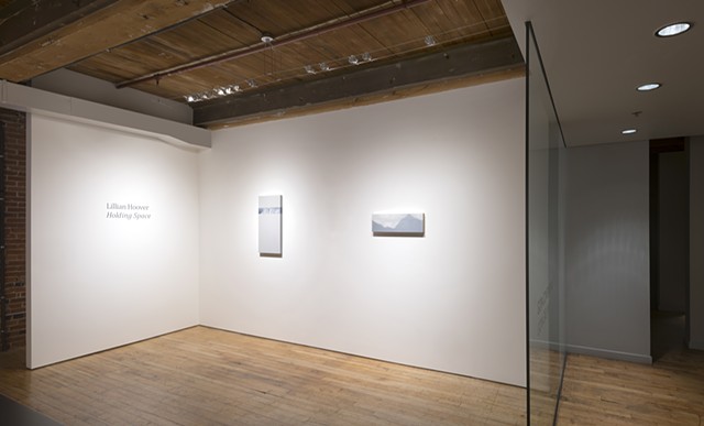
Mie Yim, New York, NYHolding Space at Goya Contemporary, January 10 - March 2, 2018
For the Moment Artist Talk at VisArts' Gibbs Street Gallery, October 2016
Mark Jenkins. Washington Post, February 2016
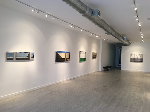
Lillian Bayley Hoover: Edges and Allowances at Honfleur GalleryText of Review:
A century ago, architects began to banish ornamentation, and painters started to forgo the illusion of depth. Descended from both is the work of Lillian Bayley Hoover, who uses everyday buildings as the real-life basis for studies of lines and planes. The Baltimore artist’s “Edges and Allowances,” at Honfleur Gallery, emphasizes the abstract geometry of walls and doors, posts and downspouts.
Yet Hoover is a realist, not an abstractionist. She employs perspective and modeling to simulate the third dimension of warehouses, sound barriers and supermarkets. Pipes and other skeletal metal forms appear to stand in front of the mostly featureless facades, and sometimes open sky frames the usually flat roofs.
These blue skies, and the bright green facade of “Farmer’s Market,” punctuate compositions that are mostly tan, brown and gray. That last hue is essential for both metal and the shadows that draw shapes such as the triangular corner of “Loading Dock.” Light and dark can breach a scene, but so can Hoover, who cut “Safeway” into two unequal rectangles. The painter may be humbly delighted, as she writes, by “banal visual elements.” But there’s a bit of the architect in her, too, as she reveals by authoritatively constructing these vignettes.
bmore art, March 2014
Ian MacLean Davis. bmore art, May 2013
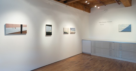
Lillian Bayley Hoover: As It Is at Goya ContemporaryText of Review:
“Movies are an empathy machine, drawing us into other lives, allowing us to identify with those of other races, genders, occupations, religions, income levels or times in history. Good films enlarge us, and are a civilizing medium. Bad films narrow us. No films at all impoverishes us.” – Roger Ebert
Lillian Bayley Hoover’s exhibition of recent paintings, “As It Is,” currently on view at Goya Contemporary, offers a humble, yet extraordinary collection of images. Over the past several years, the Trawick Award-winning artist has established herself as a reliable and thoughtful painter. While consistently strong, this work is different.
In the past, Hoover has used pictures to tell pointed stories, including imagery of significance, usually more literal than evocative. It often explored political criticism and propaganda. Earlier series were painted from dioramas and models, using cinematic staging to depict a sad, intimate and purposely false reality through a window of glossy oil paintings. Over time, the politics of the work became more personal, but at the same time, more distant in their staginess and the narratives became more mysterious. More recently, Hoover’s “Sites of Power” series sublimated a similar message. Through choosing to represent specific, but somewhat obscure international architectural locations, the paintings allowed the audience to appreciate the images separately from their content. Increasingly, Hoover’s paintings have created opportunities to take in their beauty without requiring recognition of politics or message.
All the while, Hoover’s paintings have existed in relation to each other in a way that evokes cinematic montage, using quick cuts of disconnected images, allowing the viewer to draw connections and fill in the gaps. This is a non-linear, editing-based and psychological way of telling a story. The relationship of painting to photography and film is complex, and yet unavoidably defines contemporary representational painting. How we read images, and how “painterly” a work is rendered; these are both terribly affected by an opposition of painting to the capture of image, digital or analog. Hoover is a painter and colorist of great skill and sensitivity, and here, as previously, she defines her compositions through photography. Beyond that, her paintings can be considered as images in sequence, telling a cumulative story through a series of juxtapositions related in theme.
With this newest series, Hoover removes herself almost completely from the comfort zone of “telling.” The images, in sequence and body, do not tell us anything. In opposition, the surfaces of the paintings now work ever harder to tell us what they are through textural subtleties, rather than to primarily render images. Surface detail and open context exist in these paintings in a way new to this artist.
The compositions in these paintings, compared to the preceding, are practically agoraphobic. The scope of subject has shifted drastically, as has the context. These paintings are of mundane and wholly domestic subjects. Shelves, stairs, window frames, baseboards and garden hoses; this is the stuff of suburban homeowners. However, the keen eye for color, composition and interest are as ever apparent in these new compositions despite being (seemingly) stripped of larger issues.
Only one painting hung in the gallery space falls out of line with this specific point of view – “Untitled (Hoses).” Here we are permitted to go outside. All other viewpoints are inevitably tied to looking inside or out of a house. Within this house, awkwardness prevails in Hoover’s compositions. The angles and viewpoints shown in these paintings find uniqueness in their strangeness and discomfort. The compositions ask the viewer to consider “from what position am I viewing this?” This sort of question continues the consideration of photography, as the viewpoints become increasingly uncomfortable. Under the table, zoomed into the window ledge, for instance. Was this painted from direct observation? Of course not. While it might be attractive to consider the genius artist who can sit, paint and control such a composition, that is not the point of this sort of painting anymore. These paintings attempt to freeze observed reality through photography, while rendering them in a magical way. Paintings like these are not a replication of photography, or reality, but an enhancement of such through the medium.
If there is a single painting and image that most embodies Hoover’s thoughts and process in these works, it is “Untitled (Cords).” The image is that of a wall, which functions as the primary ground for the composition, colored and painted as a nearly-disgusting “dusty rose.” Shadows and projections of light interact on the plane. Cords (recognizable as computer and/or monitor power cords, by their color and thickness) cast shadows upon the wall, hanging in a recognizable fashion. Balancing and defining the composition are striking soft triangles, read as vivid projections of light. The shapes imply that the light has been shaped and filtered through the mask of horizontal blinds. But while the light shapes are recognizable, they are not obvious.
There is something instantly recognizable about the image and situation, but at the same time, they are enigmatic in their awkwardness. Place yourself in this position. From what angle do we, any of us, view this? How strange is that viewpoint? The silly answer is – cleaning. These are the moments where we each have the opportunity to notice little shadows and refractions, and yet are rushed and so focused on the task-at-hand that they are missed. Which parts of this observation was intended by the artist? We can only pre-suppose, but it’s certain that Lillian Bayley Hoover has transitioned from telling to showing and allowing our own observations and experience to lead the way.
The way the work is presented in the viewing room at Goya Contemporary is, as always, considered and thoughtful. Despite this, I do wonder how a different arrangement would have changed how the images (only one element of the paintings) are read. On one hand, the most difficult aspect of the space is always the narrow corridor that leads from the main gallery into this smaller viewing space. It is an uncomfortable transition from the main gallery into the viewing room. Here, curator Amy Raehse takes advantage of that awkwardness by hanging one of the most uncomfortable and cramped compositions on the transitional wall. Physically, as visitors walk past the painting in a similar space to that of the compositional viewpoint in a pleasing moment of synchronicity. On the other hand, in the gallery itself, the paintings are arranged in pairs and in singles that direct the narrative between paintings more than I would have preferred.
The basic concept of film montage mentioned earlier is largely directed by the idea of pacing. In film, the duration of time a sequence or image lingers before a cut dictates this pacing, and also establishes priority. With these paintings, the layout and gaps between works function in a similar way – physical space and arrangement representing time. As hung in this space, the arrangement appears to be directed by scale and shape of painting, as well as color relationships from painting to painting. An alternative hanging with no pairings and each painting spaced more equitably could present a more open narrative, flattening the read of possible stories. As it is, the presentation is handsome. But these presentational choices limit the possibility to make different sorts of connections between paintings.
This writing began with a quote from the recently late film critic Roger Ebert. While a connection between Hoover’s use of images and film montage has already been offered, that is not the core of why the quote is included here. Ebert’s statement was specific to film, but can be easily applied to certain types of visual art. Which is to say, not all art seeks to create empathy. In fact, much contemporary art actively seeks to alienate or disregard their audience in the cause of challenge and relevance. Hoover’s work has always reached out to viewers, even pleading at times, but always with respect and a desire to connect. The work in “As It Is” creates charisma in its accessibility, transforming tiny moments into atmospheric short stories that tell us little, while offering plenty, within a specific domestic world that most can connect to.
Salcman, Michael. Little Patuxent Review, Summer 2011
Painting Across the Digital Divide: The Art of Lillian Bayley Hoover
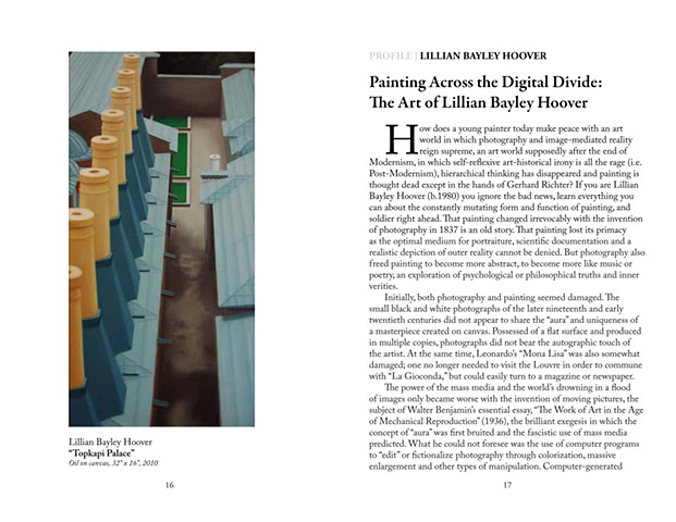
Text of Profile:How does a young painter today make peace with an art world in which photography and image-mediated reality reign supreme, an art world supposedly after the end of Modernism, in which self-reflexive art-historical irony is all the rage (i.e. Post-Modernism), hierarchical thinking has disappeared and painting is thought dead except in the hands of Gerhard Richter? If you are Lillian Bayley Hoover (b.1980) you ignore the bad news, learn everything you can about the constantly mutating form and function of painting, and soldier right ahead. That painting changed irrevocably with the invention of photography in 1837 is an old story. That painting lost its primacy as the optimal medium for portraiture, scientific documentation and a realistic depiction of outer reality cannot be denied. But photography also freed painting to become more abstract, to become more like music or poetry, an exploration of psychological or philosophical truths and inner verities.
Initially, both photography and painting seemed damaged. The small black and white photographs of the later nineteenth and early twentieth centuries did not appear to share the “aura’’ and uniqueness of a masterpiece created on canvas. Possessed of a flat surface and produced in multiple copies, photographs did not bear the autographic touch of the artist. At the same time, Leonardo’s “Mona Lisa” was also somewhat damaged; one no longer needed to visit the Louvre in order to commune with “La Gioconda,” but could easily turn to a magazine or newspaper.
The power of the mass media and the world’s drowning in a flood of images only became worse with the invention of moving pictures, the subject of Walter Benjamin’s essential essay, ‘‘The Work of Art in the Age of Mechanical Reproduction’’ (1936), the brilliant exegesis in which the concept of ‘‘aura’’ was first bruited and the fascistic use of mass media predicted. What he could not foresee was the use of computer programs to ‘‘edit’’ or fictionalize photography through colorization, massive enlargement and other types of manipulation. Computer-generated effects made it far easier for the photograph to “lie;” it was no longer a reliable record of objective reality.
In fact, artists like James Casabere, Thomas Demand and Adam Fuss use tabletop models and walk-in installations made of cardboard to provide completely believable alternative realities available for photographic documentation. Typically, the models are destroyed after the photograph is made. And that master of self-disguise, Cindy Sherman, the doyenne of Post-Modernism, uses her own unrecognizable face and figure as the sole subject of the dramas she enacts in front of the camera. Photography became the feminist’s weapon of choice and a substitute or ‘‘simulacrum’’ of painting, aping the coloristic effects and grand scale of the older medium, taking upon itself the functions of nineteenth-century history painting and twentieth-century surrealism and fantasy. For the umpteenth time in the course of the twentieth century, painting appeared to be well and truly ‘‘dead.’’
* * *
Into this debate on the role of photography in late Modernism and the relative importance of painting stepped Gerhard Richter (b. 1932), who has spent fifty years utilizing painting to comment on photography rather than the other way around. With the technical virtuosity of a Vermeer and the conceptual brilliance of a Duchamp, Richter has managed to recuperate all of the classical tropes of painting, its usefulness in scientific documentation, portraiture and history, its ability to fool the eye, the concept of the masterpiece and the uniqueness of the author while, at the same time, eschewing all evidence of emotion, and denying the possibility of a ‘‘signature style.’’ By signature style I mean all those elements of a picture—like paint handling, color palette and range of subject matter—that make any authentic Monet or Rembrandt self-evidently look like a ‘‘Monet’’ or a ‘‘Rembrandt’’ whether or not the painting is signed.
Richter’s two apparently separate styles, one photorealist and one abstract, are linked by the fact that he paints photographs, that is to say, photorealist paintings that look like photographs, some he has taken, others travel souvenirs and postcards or found snapshots in the meaning that Duchamp gave to his ‘‘readymade’’ objects. Richter sometimes paints on photographs directly thereby expunging the physical separation of the two media, the photographic ground contributing the representational (i.e., figurative) component of the picture while his brushstrokes add the abstract element.
In Richter’s hall of mirrors, it is possible to buy an original photograph he’s recently made of a painting that he once painted, a painting itself based on a photograph taken or found by Richter. Richter has even painted wholly abstract paintings based on photographs of brushstrokes randomly made and smeared on specimen cards kept in his files and documented in his on-going project, Atlas. In this way and others, Richter eliminates the conceptual difference between photography and painting since all of his early work, whether wholly abstract or wholly figurative in nature, is based on an image-mediated world (i.e., photographs) rather than any actual experience of the real world. Richter believes in the essential equivalency of abstraction and representation; he has painted hundreds of works in each mode but rarely combines the two. Hoover does not avoid this conflict; she too makes paintings out of photographs but, increasingly, she combines realism and abstraction on the same canvas."
* * *
In fact, Lillian Hoover has chosen to go Richter one step better by making paintings based on photographs of imaginary structures constructed through the conceptual model-making or table-top strategy of Casabere and Demand. Her painstaking technique results in half-adozen paintings a year, some of which require months for completion.
In the first stage, Hoover decides on a theme, not infrequently a highly charged topic about societal power structures, and builds miniature environments for the store-bought doll-sized figures that she situates within her artificial spaces. In Hoover’s second step, she obsessively relights and re-photographs her models, compulsively making millimeter adjustments. The use of dollhouse figures and props in the first two steps relates Hoover’s artistic program to that of Laurie Simmons (b.1949), a pioneering feminist photographer. In both artists, there is a whiff of the romantic and a frank desire to create an emotional response within the viewer. Simmons has admitted as much, and in recent years has actually designed a dollhouse that comes complete with contemporary paintings and sculpture.
In Hoover’s third and final stage, having built her models and adjusted the resulting photographs, she finally begins the painting by roughing in certain shapes projected onto the canvas, then continues free hand, making changes by reference to the photographs she has shot. The three-step process of model-making, photographing and painting results in a subtle chilling effect or “distancing,” an emotional coolness superficially similar to that of Richter’s, in which the viewer is encouraged to spend time slowly surveying the surface of the painting without immediately engaging its possibly incendiary content.
In ‘‘Uncle Rudi’’ (1965), a Richter painting based on a family snapshot of his father’s brother proudly posed and smiling in his Wehrmacht uniform, our conscious horror of the family’s situation (and that of the artist) in regard to their Nazi history is slowed and delayed by the intentional use of turpentine-loaded implements to blur the image as a camera lens might. This conceptual trope catches the viewer’s eye and obscures critical information. Similarly, in “Stop” (2007) Hoover first engages our eyes with the beautifully painted foliage and carefully posed middle-class dolls she’s placed within a model of a Baltimore Light-Rail station before we notice how oblivious the figures are to the horrifying photograph inserted into the advertising frame on the station platform. This carefully painted simulacrum of a found photograph of suffering humanity in a war-torn country is a subtle indictment of casual indifference."
* * *
Of course Hoover is much more than a crafty polemicist. A graduate of the University of North Carolina-Asheville, where she received a liberal arts background in art history and philosophy in addition to her Bachelor of Fine Arts, and of Maryland Institute College of Art in Baltimore where she sharpened her studio skills and earned her Master of Fine Arts, Hoover is highly aware of the theoretical situation surrounding her own work. She constantly challenges her technical proficiency by creating compositional “errors” to cue the viewer, create unease and challenge our expectations of a “perfect” painting. Other contemporary artists have used the related strategy of “de-skilling” to disturb their otherwise immaculate surfaces with randomness: by allowing gravity to determine the final placement of paint on the canvas (Jackson Pollock, Morris Louis), by painting subjects upside down before righting the painting (Baselitz) or by using a long shrubbery branch rather than a brush to reduce the manual control involved in making a mark (Brice Marden). Hoover’s subtle “mistakes” introduce what she calls an element of “awkwardness” through the elision of a critical detail in the photograph or a failure to edit out clues as to the artificial nature of the “reality” she presents to us. This strategy is much more telling in her recent work; I take this awkwardness to be the equivalent of de-skilling but it’s also a way of telling us there are no utopian spaces in either her painted world or the one we inhabit."
* * *
Many of the new paintings are based on a trip Hoover took to visit Istanbul and its remarkable Miniaturk Park, a permanent outdoor installation in which Turkey’s most famous architectural structures (mosques, palaces, bridges, airports) are faithfully reproduced on a scale appropriate to a child’s playground. Some of the models have not weathered well and the adventitial cracks and displacements introduce their own subtle imperfections, like the off-center column in “Observatory.” The Miniaturk experience radically changed Hoover’s approach in at least two important respects: first, she no longer needed to build a model in order to photograph it because the Miniaturk structures were readymade models or found objects in the Duchampian sense, and second, because they were purely architectural in nature, eerily free of people.
Her almost monochrome painting of three jet bridges in a deserted airport has a disturbing sense of menace, one that the presence of her dollhouse figures would only reduce, not because of any deeply buried criticism of corporate institutions, but because we subconsciously associate cleared airports with the threat of terrorism. The three jet bridges in “Ataturk Airport” (2010) surround a large open area of concrete like menacing claws. This area empty of any realistic reference clearly indicates Hoover’s profound and growing interest in the abstract composition of her pictures and her blank color scale echoes Richter’s favorite palette of silvery grays. The new architectural paintings also link her to a much younger German artist, Eberhard Havekost (b.1967) of Dresden. However Havekost’s tilted-up balconies and strangely cropped cars and buildings usually have a lick of bright white or red, a dab of slathered painterly cuisine Hoover eschews in her rigidly flat surfaces.
The Miniaturk paintings reach a kind of apotheosis in her beautifully composed study of a model of the Suleymaniye Mosque, a picture in which shadows of two of the four minarets slant in from the right and cross against an intricate V-shaped pattern of walkways from which every brick and paving stone has been expunged. Hoover alerts us to the true nature of the painting’s source by giving us a little clue, the up-turned nose of the Astroturf lawn where it’s seen peeling away from its support. Nearly a green monochrome organized almost entirely in diagonals, “Suleymaniye” is a perfect collision of abstraction and reality, two primary modes of painting that most artists keep rigidly separate, two modes that Hoover handles here with utmost delicacy and power.
—Michael Salcman
* * *
Benjamin, Walter. “The Work of Art in the Age of Mechanical Reproduction.” In: Benjamin, Walter, ed. Illuminations, Essays and Reflections. New York, NY: Schocken Books; 1969: 217-251.
Hoover, Lillian Bayley. Conversations with the artist, April 1, 2011.
Richter, Gerhard. Atlas of the Photographs. New York, NY: D.A.P.; 1997, plate 194.
Salcman, Michael. “‘Sea-Sea’ by Gerhard Richter.” Neurosurgery 68 (5):1161-1163, May, 2011.

